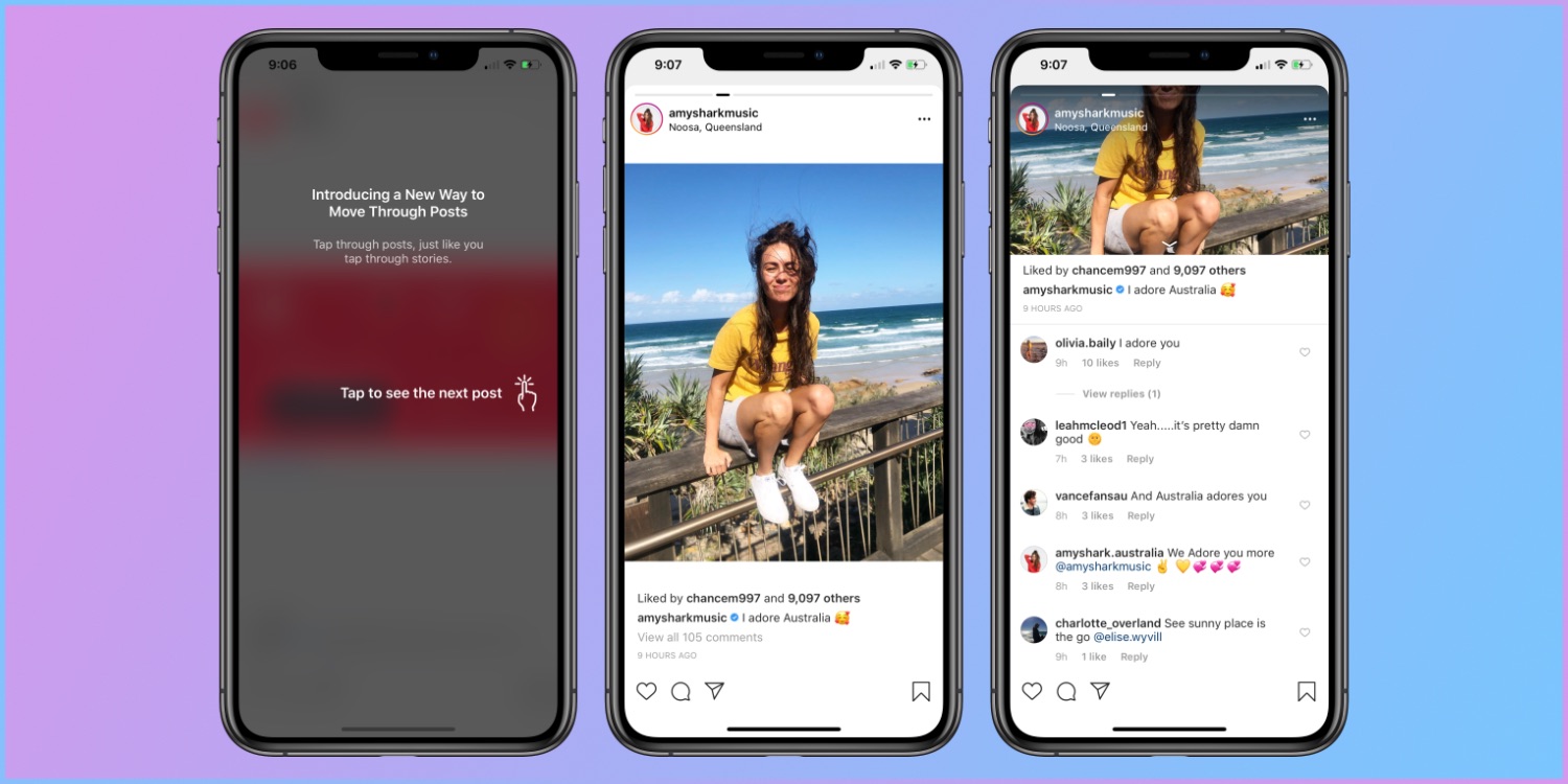
 Today, Instagram pushed out a massive update changing how users use the app entirely. The new app dynamics now require users to tap on the left or right side of the screen in order to look through their feed of accounts they follow. Scrolling up and down is a thing of the past, leaving most of us frustrated on why they made the change. If you do scroll up, you will enter the comments area of the photo you are currently on.
Most Instagram users woke up Thursday morning with no warning of the update. When opening the app, a grey screen appears stating, “Introducing a new way to move through posts. Tap through posts, just like you tap through stories”. Now, using the app feels like watching an incredibly long Instagram or Snapchat story. A change like this will take time to reprogram our muscle memory on how we use the app.
 Unfortunately, it’s pretty much impossible to avoid this new feature. The update was pushed out globally without having to physically update the app through the app stores. Instagram has used the past scrolling feature since its launch in 2010, making this change uncomfortable and unnecessary for many long time users. What are your thoughts on the tap dynamics? Is it easier to look through your timeline or was it an unnecessary change that needs to be reverted?
In the wake of the uproar the Head of Instagram clarified that this was actually just a small-scale test that had accidentally been scaled up to affect more users than intended. Simply restart your Instagram app and the sideways scrolling will be gone. So you can put down the pitchforks now.
That was supposed to be a very small test that went broad by accident. Should be fixed now. If you’re still seeing it simply restart the app. Happy holidays! 😬
— Adam Mosseri (@mosseri) December 27, 2018


